
TEMPLATES / MONOFRAME
Ready-made templates. Download, edit, ship.
Website and app UI templates designed and built by MONOFRAME. Every template comes in an HTML + Tailwind and a Next.js + Tailwind edition. Explore the live demo; purchase and download happen on Gumroad.
- Screens
- 54 screens in four parts (230 static HTML pages)
- Editions
- HTML + Tailwind, Next.js + Tailwind
- Themes
- Light and dark, 5 accent presets
- Layout
- Responsive, 360 px to 1440 px
- Font
- Familjen Grotesk, Hanken Grotesk, JetBrains Mono
- Updates
- Free for version 1.x
- License
- Personal, see LICENSE.md
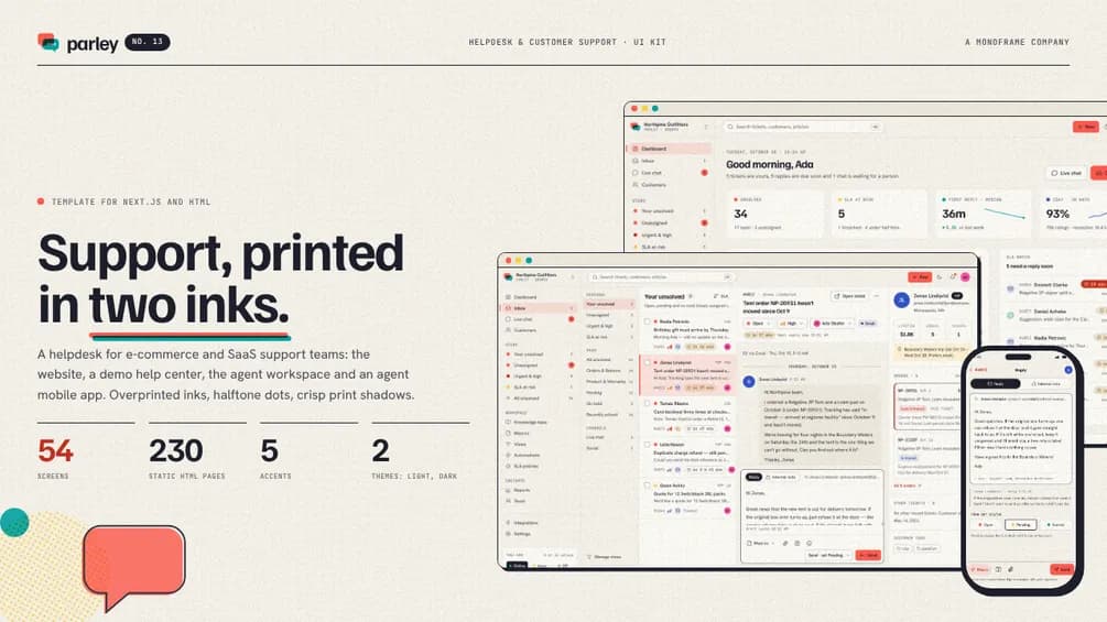
13 / Helpdesk & Customer Support UI Kit
Parley
from$49
54 screens · website, help center, agent workspace and mobile · 5 accents · light and dark · HTML and Next.js
Editions and prices
- HTML + Tailwind$49
- Next.js + Tailwind$69
- Complete (HTML + Next.js)$79
What you get (10)
Parley is a helpdesk and customer support UI kit for e-commerce and SaaS support teams and founders building support tools. It comes in four parts that work as one product and share one demo dataset: the product website with pricing, sign-up and onboarding, a demo public help center with a live chat widget, the agent workspace with a shared inbox, tickets, live chat, automations, SLA policies and reports, and an agent mobile app. The design is risograph print: two overprinted inks in tomato and teal with yellow and blue, halftone dot patterns, slight misregistration, light paper grain in the heroes, crisp print-shadow cards and medium-rounded corners on a light paper canvas, with deep ink in dark mode and SVG riso art instead of photos.
- 0154 screens in four parts, exported as 230 static HTML pages
- 02Website (15 screens): home, product tour, pricing, customers, integrations, changelog, about, contact, legal and 404, plus log in, sign up, forgot password, email verification and onboarding
- 03Help center (5 screens): a demo help center for the fictional Northpine Outfitters with 6 categories, 18 articles, a contact form, a message sent page and a live chat widget
- 04Agent workspace (19 screens): dashboard, a three-pane shared inbox with 12 views, ticket pages, customers and customer profiles, live chat, macros, views, knowledge base and article editor, automations and a rule builder, SLA policies, reports with an hour-by-weekday heatmap and CSAT, team and schedules, integrations, settings, notifications and search
- 05Agent app: 14 phone screens at 390 × 844 and a gallery page, from the queue, tickets and replies with macros to live chat, SLA alerts and personal stats
- 06One consistent demo dataset: status counts, view counts, SLA timers and workload are computed from the ticket records, and reports add up across days, weeks, channels and agents
- 07Charts drawn in plain SVG, no chart library: area, bar, heatmap, sparkline, ring and share bars
- 08Light and dark themes and 5 accent presets (tomato, teal, blue, violet, ink), each switched by one attribute on html; ticket status, priority and channel colors stay fixed
- 09Responsive from 360 px phones to 1440 px desktops, keyboard accessible menus, tabs and dialogs
- 10Realistic demo content with fictional people, companies and products. No lorem ipsum, no stock photos
Fonts and icons: Familjen Grotesk, Hanken Grotesk and JetBrains Mono (Google Fonts, SIL Open Font License) and Lucide icons (ISC). All free for commercial use.
- Screens
- 54 screens in four parts (161 static HTML pages)
- Editions
- HTML + Tailwind, Next.js + Tailwind
- Themes
- Light and dark, 5 accent presets
- Layout
- Responsive, 360 px to 1440 px
- Font
- Archivo, Space Mono
- Updates
- Free for version 1.x
- License
- Personal, see LICENSE.md
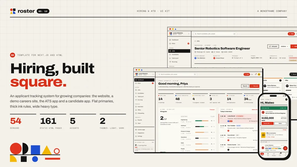
12 / Hiring & ATS UI Kit
Roster
from$49
54 screens · website, careers site, ATS app and mobile · 5 accents · light and dark · HTML and Next.js
Editions and prices
- HTML + Tailwind$49
- Next.js + Tailwind$69
- Complete (HTML + Next.js)$79
What you get (11)
Roster is a hiring and applicant tracking (ATS) UI kit for growing companies, in-house recruiting teams and founders building hiring tools. It comes in four parts that work as one product and share one demo dataset: the product website with pricing, sign-up and onboarding, a demo public careers site, the ATS app with pipeline boards, candidates, interviews, scorecards, offers and reports, and a candidate mobile app. The design is Bauhaus: circles, squares and triangles in flat red, blue and yellow, thick black rules, wide heavy headlines and mono labels on a warm off-white canvas in light and near-black in dark, with geometric SVG compositions instead of photos.
- 0154 screens in four parts, exported as 161 static HTML pages
- 02Website (15 screens): home, product tour, pricing, customers, integrations, changelog, about, contact, legal and 404, plus log in, sign up, forgot password, email verification and onboarding
- 03Careers site (3 screens): a demo careers site for the fictional Lumen Robotics with a filterable job board, 14 job posts with an apply form, and an application sent page
- 04ATS app (21 screens): dashboard, jobs, a pipeline board for every job, new job wizard, candidates and candidate profiles, talent pool, sourcing, interview calendar, interview kits with scorecards, offers with approvals, onboarding, inbox, reports, team, careers page editor, integrations, settings, notifications and search
- 05Candidate app: 14 phone screens at 390 × 844 and a gallery page, from applications and status to picking a slot, interview prep, the offer and preboarding
- 06One consistent demo dataset: stage counts, pipeline totals, offer states and the 12-month reports are computed from the records
- 07Charts drawn in plain SVG, no chart library: bar, area, funnel, ring and share bars
- 08Light and dark themes and 5 accent presets (red, blue, yellow, green, ink), each switched by one attribute on html; pipeline stages keep a fixed palette
- 09Fair hiring by default: no photos, ages or demographic fields on people; diversity reporting is aggregate and voluntary
- 10Responsive from 360 px phones to 1440 px desktops, keyboard accessible menus, tabs and dialogs
- 11Realistic demo content with fictional people, companies and products. No lorem ipsum, no stock photos
Fonts and icons: Archivo and Space Mono (Google Fonts, SIL Open Font License) and Lucide icons (ISC). All free for commercial use.
- Screens
- 55 screens in three parts (154 static HTML pages)
- Editions
- HTML + Tailwind, Next.js + Tailwind
- Themes
- Light and dark, 5 accent presets
- Layout
- Responsive, 360 px to 1440 px
- Font
- Geist, Geist Mono, Instrument Serif
- Updates
- Free for version 1.x
- License
- Personal, see LICENSE.md
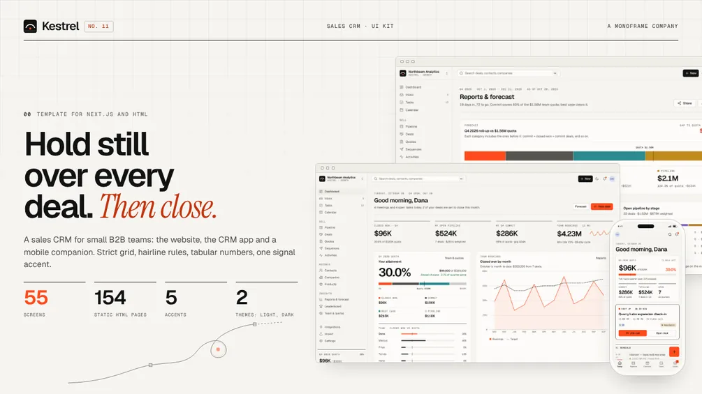
11 / Sales CRM UI Kit
Kestrel
from$49
55 screens · website, CRM app and mobile · 5 accents · light and dark · HTML and Next.js
Editions and prices
- HTML + Tailwind$49
- Next.js + Tailwind$69
- Complete (HTML + Next.js)$79
What you get (9)
Kestrel is a sales CRM UI kit for small B2B sales teams, SaaS founders and agencies building sales tools. It comes in three parts that work as one product and share one demo dataset: the product website with pricing, sign-up and onboarding, the CRM app with a pipeline board, deals, an inbox, sequences and a forecast, and a mobile companion. The design is Swiss precision: a strict grid, hairline rules instead of shadows, tabular numbers, a warm paper canvas in light and graphite in dark, one signal accent and an SVG flight-path motif instead of photos.
- 0155 screens in three parts, exported as 154 static HTML pages
- 02Website (15 screens): home, product tour, pricing, customers, integrations, changelog, about, contact, legal and 404, plus log in, sign up, forgot password, email verification and onboarding
- 03CRM app (25 screens): dashboard, pipeline board, deals, contacts and companies with detail pages, inbox, sequences with a sequence page, tasks, calendar, activities, reports and forecast, quotes with a quote page, price book, team and quotas, leaderboard, integrations, settings, notifications, search and import
- 04Mobile companion: 14 phone screens at 390 × 844 and a gallery page, from today and pipeline to deal, call log, quick note, inbox and card scan
- 05One consistent demo dataset: stage totals, quota attainment, bookings and the quarterly forecast are computed from the deal records
- 06Charts drawn in plain SVG, no chart library: area, stacked bar, sparkline, ring and share bars
- 07Light and dark themes and 5 accent presets (vermilion, cobalt, emerald, violet, amber), each switched by one attribute on html; deal stages keep a fixed palette
- 08Responsive from 360 px phones to 1440 px desktops, keyboard accessible menus, tabs and dialogs
- 09Realistic demo content with fictional people, companies and products. No lorem ipsum, no stock photos
Fonts and icons: Geist, Geist Mono and Instrument Serif (Google Fonts, SIL Open Font License) and Lucide icons (ISC). All free for commercial use.
- Screens
- 69 screens in four parts (116 static HTML pages)
- Editions
- HTML + Tailwind, Next.js + Tailwind
- Themes
- Light and dark, 5 accent presets
- Layout
- Responsive, 360 px to 1440 px
- Font
- Bricolage Grotesque, Nunito, Martian Mono
- Updates
- Free for version 1.x
- License
- Personal, see LICENSE.md
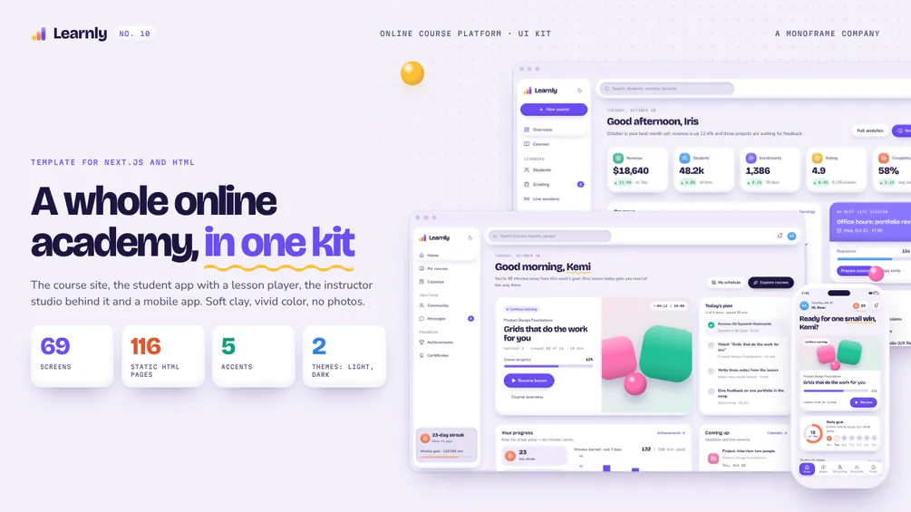
10 / Online Course Platform UI Kit
Learnly
from$49
69 screens · site, student app, studio and mobile · 5 accents · light and dark · HTML and Next.js
Editions and prices
- HTML + Tailwind$49
- Next.js + Tailwind$69
- Complete (HTML + Next.js)$79
What you get (9)
Learnly is an online course platform UI kit for course creators, academies, bootcamps and edtech teams. It comes in four parts that work as one product: the academy website with course pages, sign-up and onboarding, the student app with a lesson player, quizzes and certificates, the instructor studio behind it, and a mobile app. The design is claymorphism done with restraint: soft clay surfaces, pill controls, a vivid but orderly palette, light and dark themes, five accent presets and glossy SVG clay illustrations instead of photos.
- 0169 screens in four parts, exported as 116 static HTML pages
- 02Academy site (16 screens): home, course catalog, course page, learning paths, teach, teams, pricing, about, contact, legal and 404, plus log in, sign up, forgot password, email verification and onboarding
- 03Student app (19 screens): dashboard, my courses, course overview, lesson player with notes, transcript and Q&A, quiz and quiz result, project submission, certificates with a verify page, calendar, community with threads, messages, achievements, notifications, search, explore, checkout and settings
- 04Instructor studio (15 screens): overview, courses, course builder, new course, lesson editor, quiz editor, students with learner detail, grading, live sessions, reviews, analytics, earnings, promotions and settings
- 05Mobile app: 18 phone screens at 390 × 844 and a gallery page, from welcome and onboarding to lesson, quiz, streak, downloads, Learnly Plus and certificate
- 06Charts drawn in plain SVG, no chart library: area, bar, sparkline, ring and share bars
- 07Light and dark themes and 5 accent presets (grape, coral, mint, ocean, berry), each switched by one attribute on html
- 08Responsive from 360 px phones to 1440 px desktops, keyboard accessible menus, tabs and dialogs
- 09Realistic demo content with fictional people, courses and schools. No lorem ipsum, no stock photos
Fonts and icons: Bricolage Grotesque, Nunito and Martian Mono (Google Fonts, SIL Open Font License) and Lucide icons (ISC). All free for commercial use.
- Screens
- 46 pages in three parts (80 static HTML pages)
- Editions
- HTML + Tailwind, Next.js + Tailwind
- Themes
- Light and dark, 5 accent presets
- Layout
- Responsive, 360 px to 1440 px
- Font
- Fraunces, Hanken Grotesk, Spline Sans Mono
- Updates
- Free for version 1.x
- License
- Personal, see LICENSE.md
09 / Newsletter & Membership Platform Template
Issue
from$39
46 pages · site, publication and dashboard · 5 accents · light and dark · HTML and Next.js
Editions and prices
- HTML + Tailwind$39
- Next.js + Tailwind$55
- Complete (HTML + Next.js)$79
What you get (8)
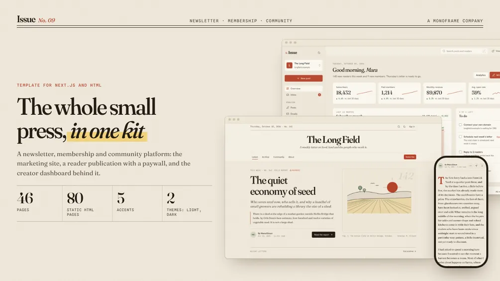
Issue is a newsletter, membership and community platform template for founders, agencies and independent writers. It comes in three parts that work as one product: the platform's marketing site with sign-up and onboarding, a reader-facing sample publication with posts, a paywall, checkout and a members' community, and the creator dashboard behind it. The design is editorial: paper and ink in light and dark, serif reading type with drop caps and pull quotes, five accent presets and hand-drawn SVG illustrations instead of stock photos.
- 0146 pages in three parts, exported as 80 static HTML pages
- 02Platform site: home, features, pricing, discover, migrate, about, contact and legal, plus log in, sign up, forgot password, email verification and a five-step onboarding
- 03Sample publication, The Long Field by Mara Ellison: home, archive, posts with drop caps, pull quotes and footnotes, a paywall you can preview as a free reader or a member, about, subscribe, checkout, gift, welcome, community with threads and a reader account
- 04Creator dashboard: overview, inbox, posts, editor, post stats, subscribers with detail and CSV import, tiers, offers, community moderation, referrals, emails with an automation builder, analytics, revenue, payouts and settings for general, domain, team and billing
- 05Charts drawn in plain SVG, no chart library: area, bar, sparkline and funnel views
- 06Light and dark themes and 5 accent presets (vermilion, moss, ink, plum, ochre), each switched by one attribute on html
- 07Responsive from 360 px phones to 1440 px desktops, keyboard accessible menus, tabs and dialogs
- 08Realistic demo content with fictional people and publications. No lorem ipsum, no stock photos
Fonts and icons: Fraunces, Hanken Grotesk and Spline Sans Mono (Google Fonts, SIL Open Font License) and Lucide icons (ISC). All free for commercial use.
- Screens
- 36 components, 26 blocks, 7 example apps (53 pages)
- Editions
- HTML + Tailwind, Next.js + Tailwind
- Themes
- Light and dark, 6 accents, 5 radius presets
- Layout
- Responsive, 360 px to 1440 px
- Font
- Instrument Sans, DM Mono
- Updates
- Free for version 1.x
- License
- Personal, see LICENSE.md
08 / Component Library & Design System for React
Plinth
from$45
36 components · 26 blocks · 7 example apps · 6 themes · HTML and Next.js
Editions and prices
- HTML + Tailwind$45
- Next.js + Tailwind$65
- Complete (HTML + Next.js)$89
What you get (8)
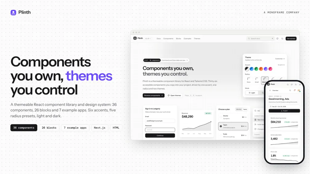
Plinth is a themeable React component library and design system for product teams, agencies and indie makers. It gives you 36 accessible components, 26 page blocks and 7 complete example apps, all driven by a handful of design tokens: one accent, one radius value and a light and dark palette. Every component is a single readable file you copy into your project and own. No package to fight and no runtime dependency beyond React, Tailwind CSS and Lucide icons.
- 0136 components with live examples, props tables and accessibility notes. Inputs: button, input, textarea, select, checkbox, radio group, switch, slider, segmented control, combobox, date picker, file upload. Overlays and navigation: dialog, sheet, popover, tooltip, dropdown menu, command palette, toast, tabs, accordion, breadcrumb, pagination, stepper. Data display: avatar, badge, card, alert, progress, skeleton, table, data table, empty state, kbd, stat, charts
- 02A data table with sorting, filtering, selection and pagination, a ⌘K command palette, a keyboard-first date picker and line, area, bar and donut charts, all written from scratch
- 03Theme system: 6 accent presets, 5 radius presets, light and dark. One attribute on html switches each, and the theme customizer writes the CSS for you
- 0426 blocks: heroes, features, stats, pricing, testimonials, CTA, auth, forms, tables, lists, empty states, footers, navigation
- 057 example apps: a SaaS dashboard, a mail client, a kanban task board, settings, authentication, pricing and onboarding
- 06A documentation site for the library: introduction, installation, theming, design tokens and a page per component, with ⌘K search
- 07Responsive from 360 px phones to 1440 px desktops, keyboard accessible, WAI-ARIA patterns throughout
- 08Realistic demo content. No lorem ipsum, no stock photos
Fonts and icons: Instrument Sans and DM Mono (Google Fonts, SIL Open Font License) and Lucide icons (ISC). All free for commercial use.
- Screens
- 31 (43 pages) + component library
- Editions
- HTML + Tailwind, Next.js + Tailwind
- Themes
- Light and dark
- Layout
- Responsive, 360 px to 1440 px
- Font
- IBM Plex Sans, IBM Plex Mono
- Updates
- Free for version 1.x
- License
- Personal, see LICENSE.md
07 / Developer Docs & API Reference Template
Pagewright
from$45
31 screens · API reference · ⌘K search · Light & dark · HTML and Next.js
Editions and prices
- HTML + Tailwind$45
- Next.js + Tailwind$65
- Complete (HTML + Next.js)$89
What you get (8)
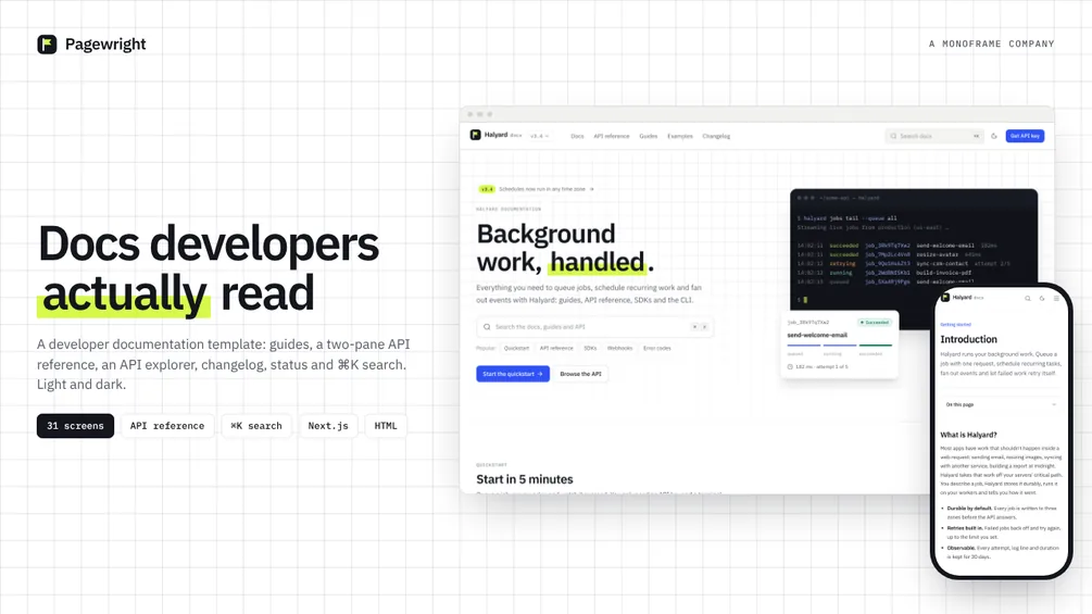
Pagewright is a developer documentation template for API companies, SaaS teams and open-source projects. It covers everything a docs site needs: a docs home, getting started, concept pages, SDK pages, a two-pane API reference, an interactive API explorer, guides, examples, a changelog, a status page, a help center and ⌘K search. Editorial and technical in style: clean paper, IBM Plex type, a cobalt accent and code blocks that stay dark in both themes. Light by default with a dark theme.
- 0131 screens across 43 pages: Docs home, Introduction, Quickstart, Installation, Authentication, Jobs, Queues, Events, Retries, Schedules, SDK overview, SDK detail (4 languages), Webhooks, Rate limits, Errors, Security, API introduction, API resource reference (6 resources), API explorer, Guides, Guide detail (6 tutorials), Examples, Changelog, Status, Support, Search, Sign in, Sign up and 404
- 02A two-pane API reference: parameters on the left, sticky request and response examples on the right, all generated from one typed data file with 25 endpoints
- 03An API explorer: pick an endpoint, fill the form, send it and get a realistic response, then copy the request as cURL, Node.js or Python
- 04Code blocks with a built-in syntax highlighter for 9 languages, language tabs that remember the reader's choice, copy buttons, file titles and marked lines
- 05⌘K search palette, “On this page” navigation with scroll spy, page feedback, previous and next links, a version switcher
- 06Documentation blocks: callouts, steps, link cards, accordions, file trees, parameter lists, method badges, diagrams
- 07Responsive from 360 px phones to 1440 px desktops
- 08Realistic demo content for a fictional API product. No lorem ipsum, no stock photos
Fonts and icons: IBM Plex Sans and IBM Plex Mono (Google Fonts, SIL Open Font License) and Lucide icons (ISC). All free for commercial use.
- Screens
- 32 + component library
- Editions
- Figma, HTML + Tailwind, Next.js + Tailwind
- Themes
- Light and dark
- Layout
- Mobile first, 360 px to 1440 px
- Font
- Manrope, JetBrains Mono
- Updates
- Free for version 1.x
- License
- Personal, see LICENSE.md
06 / Home Energy & Solar App UI Kit
Solenne
from$45
32 screens · Mobile first · Soft 3D · Light & dark · Figma, HTML and Next.js
Editions and prices
- HTML + Tailwind$45
- Figma$45
- Next.js + Tailwind$65
- Complete (Figma + HTML + Next.js)$89
What you get (7)
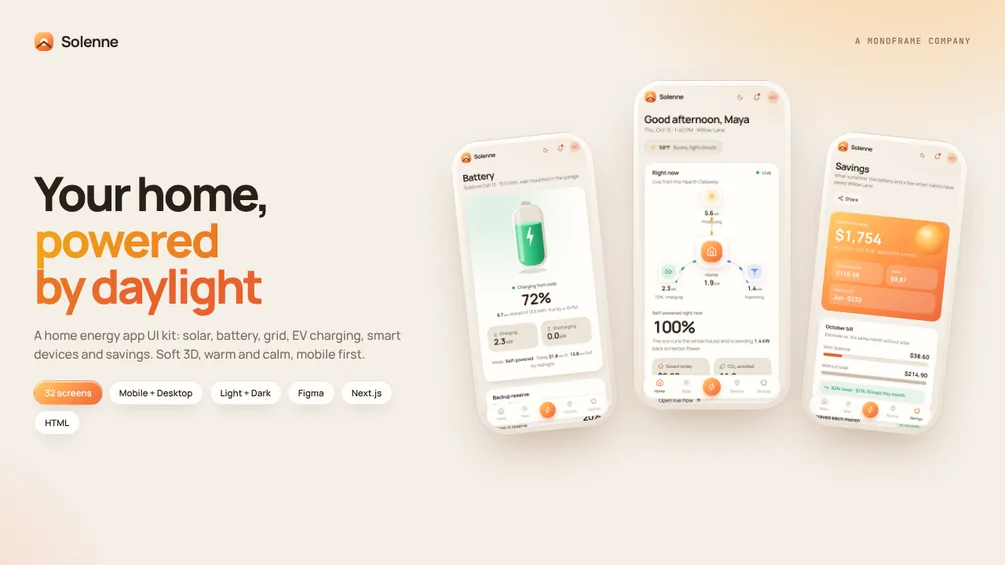
Solenne is a home energy app UI kit for solar installers, battery makers, utilities and smart-home teams. It covers the whole home energy picture: live power flow, rooftop solar, the home battery, the grid, EV charging, smart devices, rooms, automations, savings, tariffs and monthly reports. Mobile first with a floating tab bar on phones and a sidebar on desktop, in a soft 3D style: warm paper canvas, raised cards, sunrise gradients and small illustrated sun, battery and house. Light by default with a warm night dark theme, set in Manrope.
- 0132 screens: Home, Live flow, Alerts, Solar forecast, Solar, Panels, Battery, Home usage, Grid, Devices, Device detail, Rooms, Room detail, Automations, Automation detail, New automation, Savings, Tariff, Reports, Monthly report, EV charging, Settings, Home settings, System, Members, Notifications, Welcome, Sign in, Sign up, Onboarding, Add a device and 404
- 02Animated energy flow between sun, battery, grid and home that follows the direction of each flow
- 03Step-by-step flows: automation builder (When / If / Then), five-step onboarding, add-a-device pairing, sign up
- 04Charts built in, no chart library: line, bar, donut, sparkline and stat tiles, with fixed colors for solar, home, battery and grid
- 05Responsive from 360 px phones to 1440 px desktops
- 06Component library page: buttons, inputs, tabs, switches, badges, energy icons, charts, modals
- 07Realistic demo data: a full day hour by hour, 30 days, 12 months of reports, 12 devices, 7 rooms and 6 automations. No lorem ipsum, no stock photos
Fonts and icons: Manrope and JetBrains Mono (Google Fonts, SIL Open Font License) and Lucide icons (ISC). All free for commercial use.
- Pages
- 31 templates, 80 HTML pages
- Images
- 54 CC0 photographs included
- Editions
- Figma, HTML + Tailwind, Next.js + Tailwind
- Themes
- Light and dark
- Fonts
- Archivo, Geist Mono
- Responsive
- 360 px to 1600 px
- Updates
- Free
- License
- Personal, see LICENSE.md
05 / Brutalist E-commerce Template for Fashion Brands
Rawcut
from$39
31 templates · Full checkout · Mobile first · 54 CC0 photos · Figma, HTML and Next.js
Editions and prices
- HTML + Tailwind$39
- Figma$39
- Next.js + Tailwind$55
- Complete (Figma + HTML + Next.js)$79
What you get (7)
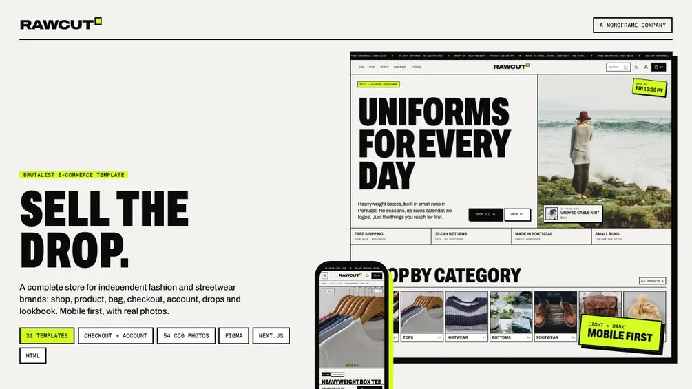
Rawcut is a complete e-commerce template for independent fashion and streetwear brands. Brutalist on purpose: hard 2px lines, no rounded corners, huge condensed type, offset shadows and one acid accent. Mobile first, light and dark, with real photos so it looks finished out of the box.
- 0131 page templates (80 pages in the HTML edition): Home, Shop all, Category, Search, Product, Size guide, Gift card, Cart, Checkout, Order confirmation, Account dashboard, Sign in, Register, Orders, Order detail, Addresses, Wishlist, Settings, Drop, Lookbook, About, Journal, Article, Stores, Help center, Shipping & returns, Contact, Privacy, Terms, Style guide and 404
- 02Full shopping flow: filters and sort, quick add, bag drawer, cart with discount codes, 4-step checkout with validation, order tracking
- 03Product page with zoom gallery, color and size pickers, size guide, sold-out and restock alerts, open-costs breakdown and reviews
- 04Drop launch page with a live countdown and waitlist, lookbook with shop-the-look
- 05App-style bottom tab bar on phones, bottom-sheet filters, sticky add to bag. Responsive from 360 px to 1600 px
- 0633 demo products and 54 royalty-free photographs included (CC0, free for commercial use)
- 07Style guide page with tokens, type scale, components and photos
Fonts and icons: Archivo and Geist Mono (Google Fonts, SIL Open Font License) and Lucide icons (ISC). All free for commercial use.
- Pages
- 25, including 3 home pages
- Images
- 53 CC0 photographs included
- Editions
- HTML + Tailwind, Next.js + Tailwind
- Theme
- Light and dark
- Fonts
- Geist, Geist Mono
- Updates
- Free
- License
- Personal, see LICENSE.md
04 / Architecture & Photography Portfolio Template
Ombrelle
from$35
25 pages · 3 home pages · Bento & bold type · Light & dark · HTML and Next.js
Editions and prices
- HTML + Tailwind$35
- Next.js + Tailwind$49
- Complete (HTML + Next.js)$69
What you get (8)
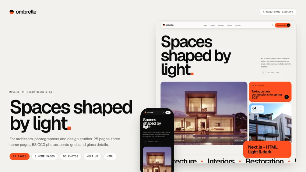
Ombrelle is a bold, modern portfolio website kit for architects, photographers and design studios. Huge, tight Geist headlines, rounded bento grids, full-width image panels, glass details and smooth scroll reveals. Light by default with a carbon dark theme and one signal-orange accent.
- 0125 page templates: three home pages (architecture studio, photographer, interiors studio), Work grid, Work archive, Project case study, Studio, Services, Process, Press & awards, Clients, Careers, Role & application, Journal, Article, Photo series, Series detail, Exhibitions, Print shop, Print detail, Contact, Project enquiry, Privacy, Style guide and 404
- 0253 royalty-free photographs of luxury modern houses and interiors included (CC0, free for commercial use)
- 03Case studies with chapters, plan and elevation drawings and a full-screen gallery
- 04Sortable archive with hover previews, work filters, reading progress, calendar downloads and a print bag
- 055-step project enquiry, contact page with an illustrated map, application form
- 06Bento layouts, pill buttons, floating glass header and pure-CSS scroll reveals and tickers
- 07Responsive from 360 px phones to 1440 px desktops
- 08Style guide page with tokens, type scale, photography and components
Fonts and icons: Geist and Geist Mono (Google Fonts, SIL Open Font License) and Lucide icons (ISC). All free for commercial use.
- Screens
- 31 + component library
- Editions
- HTML + Tailwind, Next.js + Tailwind
- Themes
- Dark and light
- Layout
- Mobile first, 360 px to 1440 px
- Font
- Geist, Geist Mono
- Updates
- Free for version 1.x
- License
- Personal, see LICENSE.md
03 / Personal Finance & Banking App UI Kit
Coinmere
from$45
31 screens · Mobile first · Glass UI · Dark & light · HTML and Next.js
Editions and prices
- HTML + Tailwind$45
- Next.js + Tailwind$65
- Complete (HTML + Next.js)$89
What you get (7)
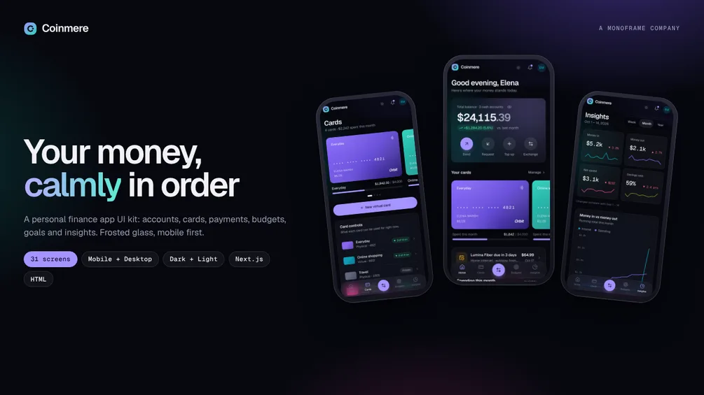
Coinmere is a personal finance app UI kit for fintech teams and neobank side projects. It covers everyday money end to end: balances and accounts, physical and virtual cards, payments, bills, budgets, savings goals, insights and investing. Mobile first with a bottom tab bar on phones and a sidebar on desktop, in frosted glass over a soft aurora. Dark by default with a light theme, set in Geist.
- 0131 screens: Home, Accounts, Account detail, Cards, Card detail, Transactions, Transaction detail, Payments, Send money, Request money, Top up, Exchange, Bills & subscriptions, Budgets, Budget detail, Goals, Goal detail, Insights, Invest, Notifications, Settings, Profile, Security, Preferences, Help & support, Welcome, Sign in, Sign up, Onboarding, Lock screen and 404
- 02Step-by-step flows: send money with a custom keypad, request and split, currency exchange, card PIN, sign-up email code, onboarding and passcode lock
- 03Card faces in four tones with freeze, reveal details, limits and per-card controls
- 04Charts built in, no chart library: line, area, bar, donut, sparkline and stat tiles with tooltips
- 05Responsive from 360 px phones to 1440 px desktops
- 06Component library page: buttons, inputs, tabs, switches, card faces, category icons, modals, charts
- 07Realistic demo data: accounts, 63 transactions, budgets, goals, bills and a portfolio. No lorem ipsum, no stock photos
Fonts and icons: Geist and Geist Mono (Google Fonts, SIL Open Font License) and Lucide icons (ISC). All free for commercial use.
- Screens
- 28 + component library
- Editions
- HTML + Tailwind, Next.js + Tailwind
- Themes
- Dark and light
- Font
- Geist, Geist Mono
- Responsive
- 360 px to 1440 px
- Updates
- Free for version 1.x
- License
- Personal, see LICENSE.md
02 / AI Agent Console & Dashboard UI Kit
Agentfold
from$49
28 screens · Traces, evals, workflows · Dark & light · HTML and Next.js
Editions and prices
- HTML + Tailwind$49
- Next.js + Tailwind$69
- Complete (HTML + Next.js)$99
What you get (7)
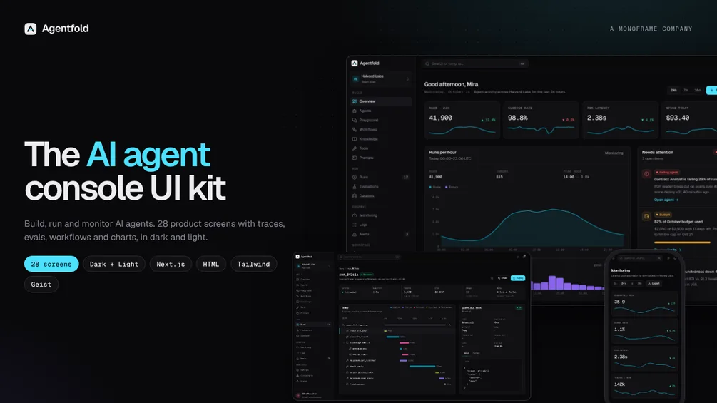
Agentfold is a dashboard kit for teams building AI products. It covers the whole life of an agent: build it, test it in a playground, wire it into a workflow, watch every run step by step, score it with evaluations and keep an eye on cost and latency. Dark by default with a light theme, set in Geist.
- 0128 screens: Overview, Agents, Agent detail, Create agent, Playground, Workflows, Workflow builder, Knowledge bases, Tools, Prompt library, Runs, Run trace viewer, Evaluations, Evaluation detail, Datasets, Monitoring, Logs, Alerts, 5 Settings pages, Sign in, Sign up, Onboarding and 404
- 02Run trace viewer with a step waterfall and an input/output inspector
- 03Workflow builder canvas with node palette, inspector and test runs
- 04Charts built in, no chart library: line, area, bar, donut, sparkline and stat tiles with tooltips
- 05⌘K command palette, mobile navigation, responsive from 360 px to 1440 px
- 06Component library page: buttons, inputs, tabs, tables, menus, modals, code blocks, charts
- 07Realistic demo data: 7 agents, 64 runs with full traces, eval suites, logs. No lorem ipsum, no stock photos
Fonts and icons: Geist and Geist Mono (Google Fonts, SIL Open Font License) and Lucide icons (ISC). All free for commercial use.
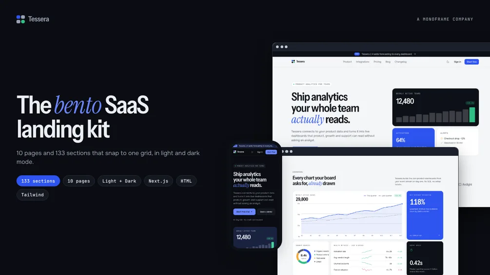
- Pages
- 10 + 404
- Sections
- 133 in 16 categories
- Editions
- Figma, HTML + Tailwind, Next.js + Tailwind
- Themes
- Light and dark
- Responsive
- 360 px to 1440 px
- Updates
- Free for version 1.x
- License
- Personal, see LICENSE.md
01 / Bento SaaS Landing Page Template
Tessera
from$39
10 pages · 133 sections · Light & dark · Figma, HTML and Next.js
Editions and prices
- HTML + Tailwind$39
- Figma$39
- Next.js + Tailwind$55
- Complete (HTML + Next.js)$79
What you get (6)
Tessera is a landing page kit for SaaS and startup teams, built around one idea: every section snaps to the same bento grid. Tiles come in four sizes, so you can mix a pricing table, a feature mosaic and a customer story on one page and it still looks designed together.
- 0110 ready pages: Home, Pricing, Features, Integrations, About, Blog, Blog post, Changelog, Contact and Sign in, plus a 404 page
- 02133 sections in 16 categories: 24 bento grids, 14 heroes, 10 feature layouts, 10 testimonials, 10 calls to action, 8 pricing sections, 8 navigation bars, 8 footers and more
- 03Light and dark mode from one set of design tokens
- 04Responsive from 360 px phones to 1440 px desktops
- 05Realistic SaaS copy, charts and product UI built in code: no lorem ipsum, no stock photos to license
- 06Interactive pieces in the Next.js edition: usage-based pricing slider, seat and savings calculators, tabbed previews, carousel, searchable FAQ, mega menu, ⌘K search and a demo-booking picker
Every section has the same ID in both editions (for example H-03 or B-17). Fonts and icons: Instrument Sans, Instrument Serif, Onest and JetBrains Mono (Google Fonts, SIL Open Font License) and Lucide icons (ISC). All free for commercial use.
PURCHASE AND LICENCE
Payment, invoice, download link and licence for every template are handled by Gumroad; wearemonoframe.com takes no payments. Prices are the Gumroad base prices in US dollars. The licence is for personal use; details are in the LICENSE.md file in the download. Refund policy on Gumroad: if a template doesn't work as described, message us within 14 days of purchase. We'll fix it, or refund you in full if we can't.
Questions? Get in touch